
Brutalist website design for brands that would rather be remembered than blend in. Big type, raw layouts, text-led pages and fast loading, built in WordPress so you can still update it yourself. We design brutalist and editorial websites from Cape Town for clients around the world.
What is brutalist web design?
Brutalist web design strips a website back to its structure: large typography, plain or single-colour backgrounds, visible grids and rules, and very little decoration. The name comes from brutalist architecture, where the concrete is left exposed. On the web it means a site that looks confident, reads quickly and feels nothing like a template.
It sits alongside a few related styles that people often search for: neo-brutalism (bold outlines, flat colour and hard shadows), minimalist website design (calm and spacious) and editorial website design (magazine-style layouts led by typography). We work across all of them.
If you want to see how far the style can be pushed, Brutalist Websites keeps a long-running collection of examples from around the world.
Who brutalist websites suit
- Magazines and journals: editorial website design with long contents lists and article pages that read like print
- Art galleries and art spaces: exhibitions, programmes and artists shown with bold type and space for the work
- Film and production companies: director rosters and reels, with the work up front
- Architecture, interior and design studios: project indexes that look like a well-kept drawing register
- Fashion labels, photographers and musicians: portfolio websites that feel like the work itself
- Tech start-ups and developer tools: neo-brutalist sites that stand out from the usual gradients
See our brutalist website concepts
Four self-initiated concept websites, each for a different industry: a fashion and culture journal, a contemporary art space, a film production company and an architecture studio. Each one is a working site, designed for desktop and phone.

A fashion and culture journal. Concept website.
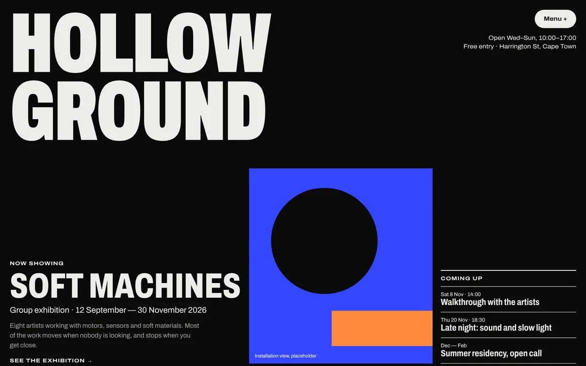
A contemporary art space. Concept website.

A film production company. Concept website.

An architecture and interiors studio. Concept website.
Bold, but built properly
- Fast: text-led pages with few heavy images, so they load quickly on any connection
- Readable: strong contrast, generous type sizes and clear navigation for every visitor
- Found on Google: real headings, page titles, descriptions and schema from day one
- Yours to edit: WordPress with Divi or a custom theme, or a lightweight static site if you prefer
- Works on phones: every layout is designed for mobile, not squeezed onto it
How we design a brutalist website
- Brief. We look at your brand, your audience and the sites you love.
- Type and structure first. We choose the typefaces and the grid before anything else, because in brutalism they do most of the work.
- Design. You see the key pages on desktop and phone, and we refine them with you.
- Build. We build it in WordPress or as a custom site, fast and accessible.
- Train and launch. We show you how to update it, then take it live.
Learn to build one yourself
Prefer to design it yourself? We run one-on-one sessions on minimal, text-led web design in Divi, working on your own site. See our WordPress courses.
Your questions
What is brutalist web design?
Brutalist web design is a raw, honest style of website: big type, plain backgrounds, visible structure, hard lines and very little decoration. It borrows its name from brutalist architecture, where the concrete is left exposed. Many brutalist websites are almost text-only, which makes them fast and easy to read.
What is the difference between brutalism, neo-brutalism and minimalism?
Brutalism is raw and text-led, often black and white with system or mono fonts. Neo-brutalism (or neubrutalism) is its brighter cousin: thick outlines, flat colour blocks and hard shadows, popular with tech start-ups. Minimalism is calm and polished, with lots of white space. We design all three, and we will tell you which one suits your brand.
Is a brutalist website bad for usability?
It does not have to be. Brutalist websites break visual rules, not usability rules. We keep clear navigation, readable text sizes, strong contrast and buttons that are easy to tap, so the site looks bold and still works for every visitor.
Is brutalist web design good for SEO?
Usually, yes. Text-led pages load quickly, use real headings and give Google plenty of words to understand. We build every brutalist site with proper titles, descriptions, schema and fast hosting, so it can rank as well as it looks.
Can I edit a brutalist website myself?
Yes. We build most brutalist websites in WordPress, either with Divi or as a custom theme, so you can change text, add projects and publish stories without touching code. Our Manage Your Own Site course teaches you on your own new website.
Will a brutalist website look dated in a few years?
Brutalism has been around on the web for more than a decade and keeps coming back, because it is built on typography and structure rather than effects. A well-made text-led site ages better than one built on this year’s animations.
More ways we can help
Tell us what you need.
You will hear back from Kate or Jeanne within one working day, with a fixed price where we can give one.
- 082 443 6575 Kate
- 083 462 8451 Jeanne
- hello@clickscount.co.za